CASE STUDY
CareerBuilder Job Seeker Redesign
MY ROLE
PLATFORMS
Lead Designer
Web, Mobile Responsive
YEAR
PERFORMANCE INCREASE
2019
60% Increase in Resume Uploads
50+ Point Increase in SUS Score
20% Increase in Applies
40% Increase in Addresable Audience
and more...
Problem
Today there are many sites where job seekers can look for new jobs. With options like this, it is essential to make sure that your site offers more and better options for users. CareerBuilder had not updated it's job seeker experience in years and could not compete with other sites. It was time for a change.
CAREERBUILDER JOB SEEKER MOBILE SITE BEFORE REDESIGN

Over 70% of job seekers are mobile users.
And CareerBuilders mobile site had not been prioritized.
Key Drivers
With so many options for consumers, it is essential to give the user exactly what they are looking for in as few clicks as possible. CareerBuilder also needed to grow their addressable audience and resume database.
UPDATE SITE TO MODERN UI/UX
An updated experience for CareerBuilder Job Seekers that surpassed our competitors (Indeed, Monster, ZipRecruiter, Glassdoor) making it easy for consumers to find jobs.
SIMPLIFY KEY TASKS FOR JOB SEEKERS
Searching for jobs is considered stressful and not fun for our consumers. Less clicks to key content helps to eliminate some pain points of having to dig for important and relevant information
INCREASE EOI, SUS SCORE & RESUME UPLOADS
Business goals need to be met as well. I had to create a design that not only focused on the user but also increased key metrics for the CB product team.
Looking at the competitive landscape - Mobile & Desktop
Most of CareerBuilder's competitors gave more information to job seekers as they first landed on the site. This gives users more of a trustworthy feeling when landing on the sites - something CareerBuilder's site was lacking.
Other sites didn't immediately ask for a resume.
More mobile-focused designs for a higher number of mobile users.

Initial Wireframes
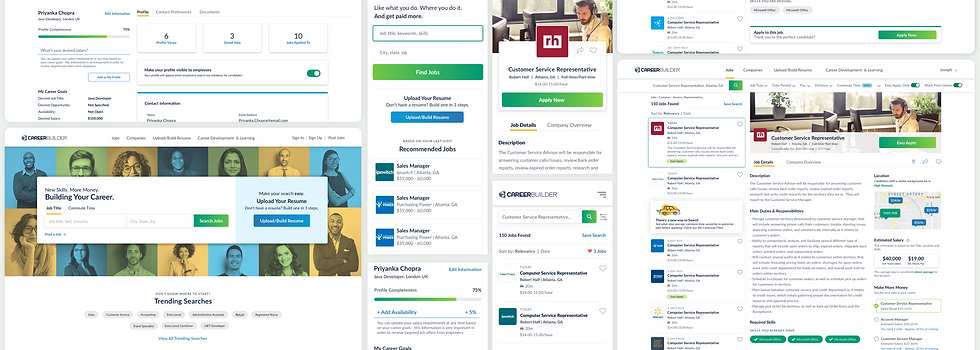
To begin, I created wires for the Homepage, Job Results Page and Job Description Page for desktop and mobile responsive web. I let user feedback that had been collected over the years as well as some initial research I did around our competitors influence my designs. I also worked with the product team to see what goals they hoped to achieve with the redesign.
FEEDBACK FROM JOB SEEKERS
-
Dated look and feel to site
-
Unaware of all that they can do on CB site
-
Difficulty in finding apply actions
-
Low SUS score of 32
MAIN GOALS PRODUCT WANTED TO ACHIEVE
-
Increase resume uploads
-
Increase applies
-
Increase overall EOI
-
Increase addressable audience


The initial wires were recieved very well by job seekers. Feedback on the new homepage was that it was simple, clean and easy to understand, with a clear path for users to enter. Users liked the simplified flow of combining the job search results page and job description page giving them the ability to quickly see multiple jobs with less clicks. They also liked the addition of logos to the job search results section saying that it helped them find familiar companies.
Final Designs

HOMEPAGE
For the redesigned Homepage, I created a design that told users how CareerBuilder could help them. The main focus when a user lands is the search input section along with a call-to-action for users to upload their resume. Directly below that there is a section that shows trending searches, this helps users who are unsure of that the want to search for when arriving at CareerBuilder. I also made sure to call out our mobile app for job seekers since over 70% of our users search for jobs and apply via mobile devices.

60%
40%
85.2

Increase in Resume Uploads
Increase in Addressable Audience
New SUS Score
JOB SEARCH RESULTS & JOB DESCRIPTION PAGE
I combined the job search results(JRP) and job description page(JDP) into one view to simplify the flow and for job seekers and eliminate clicks. In addition, I also added company logos to the results section for users to easily be able to identify companies they know and trust. To the right of the job description, I added a column that gives the user useful information, such as a map view of where the job is located along with other jobs near it. An estimated salary section for users to know if what a company is offering to pay is fair. And a section called 'Make More Money' where users can see a career path of what a promotion would be for that specific job title along with an estimated salary. These are all new additions to add value for our job seekers and helping us to stand out from our competitors.


8%
20%
42%

